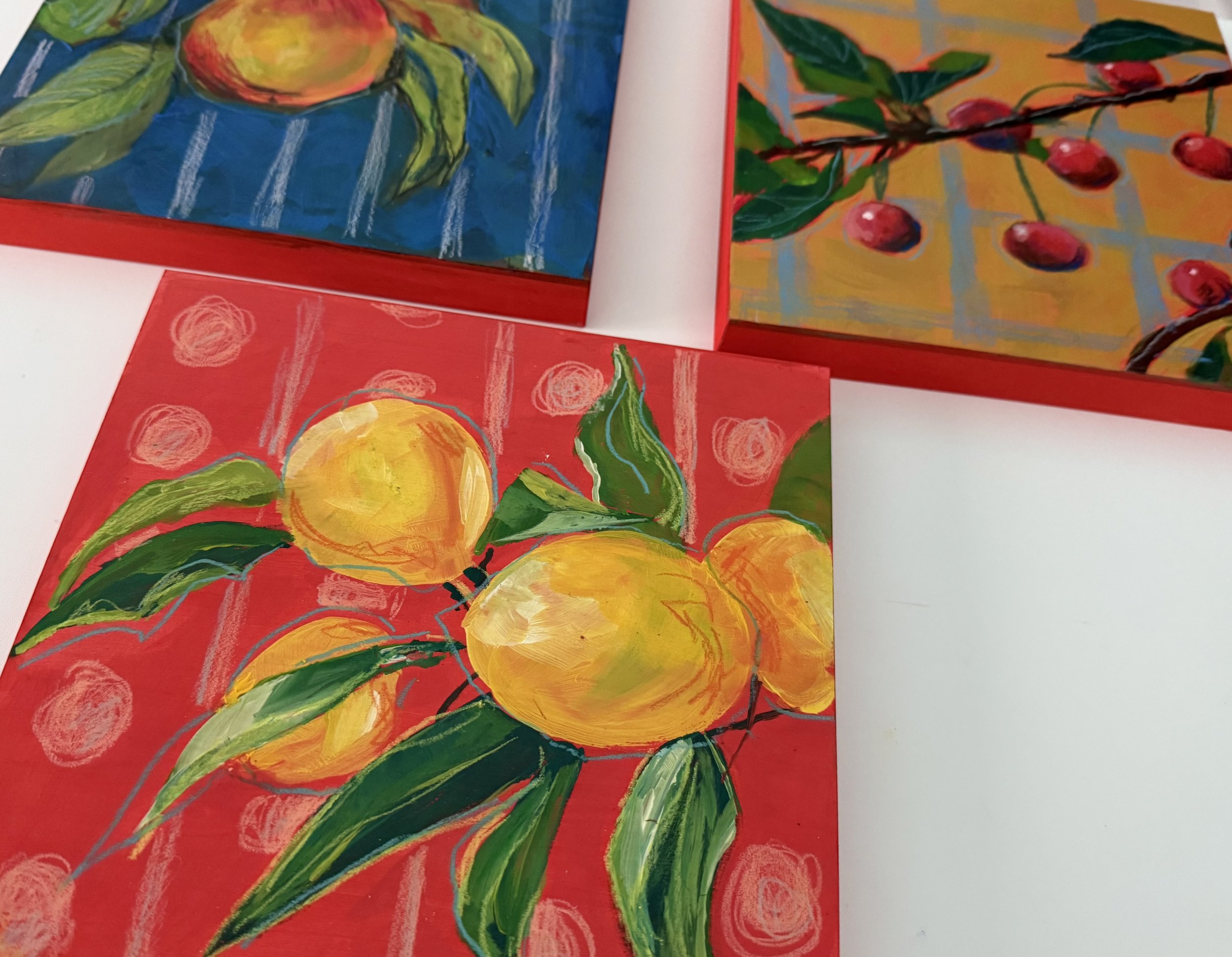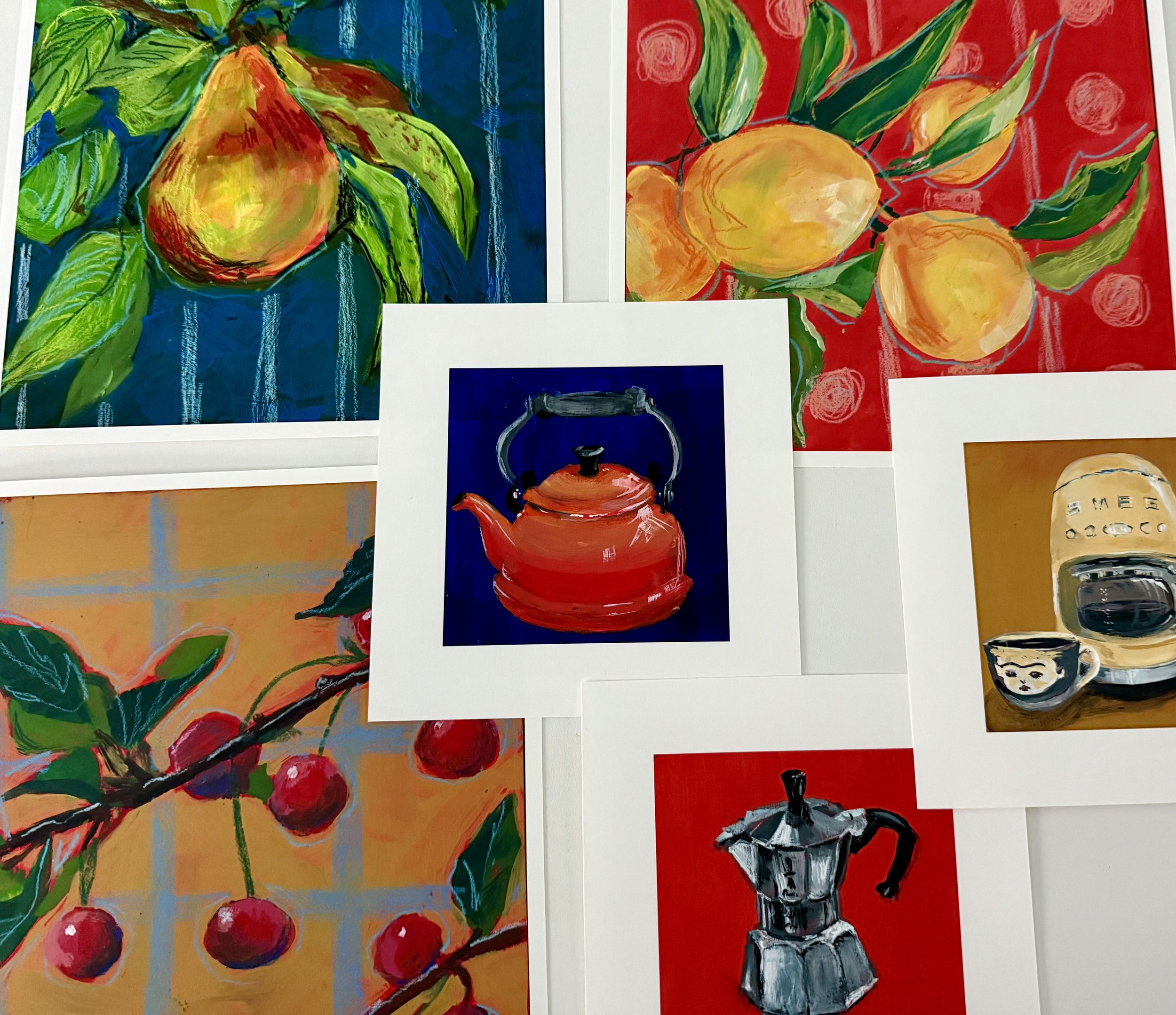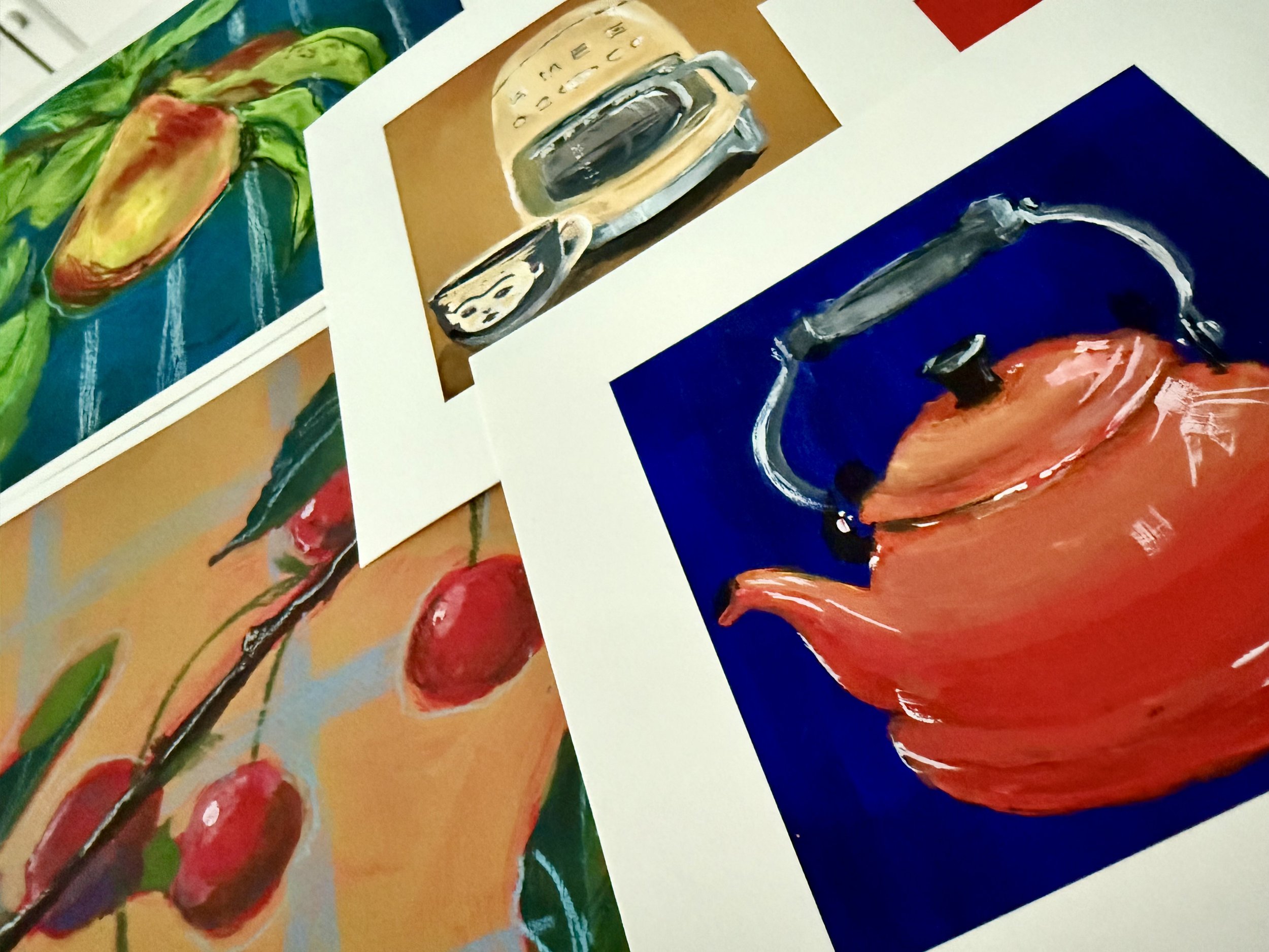
Update on Spring and Summer - I’m looking back on my phone photo gallery and while it hasn’t been a terribly busy time, I have managed to get some sketching in. The current state of the world, especially here in the US, is doing a number on my nervous system. Having art in my life, either as a consumer or maker, is vital. Creativity is resistance. Color is resistance. Nonconformity is resistance. I refuse to give away my joy. Don’t give away yours. x
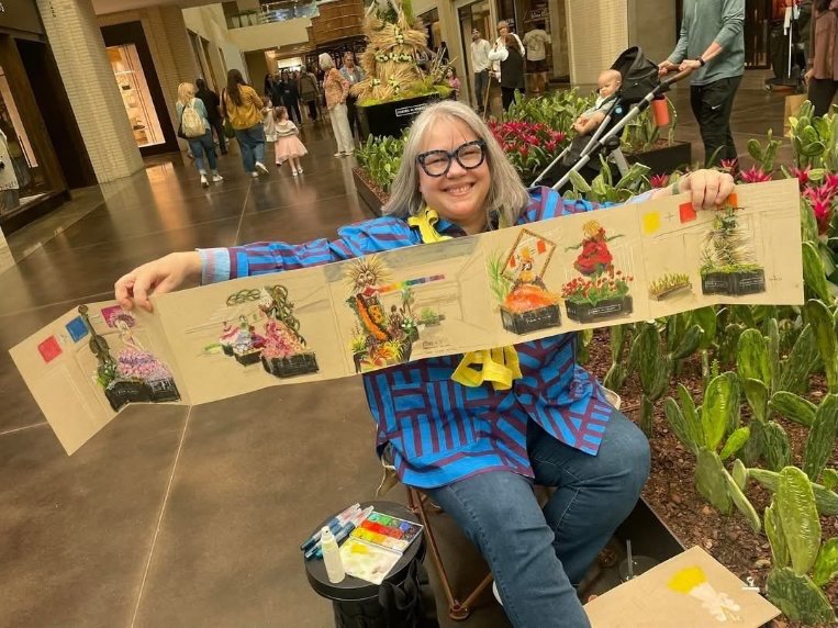
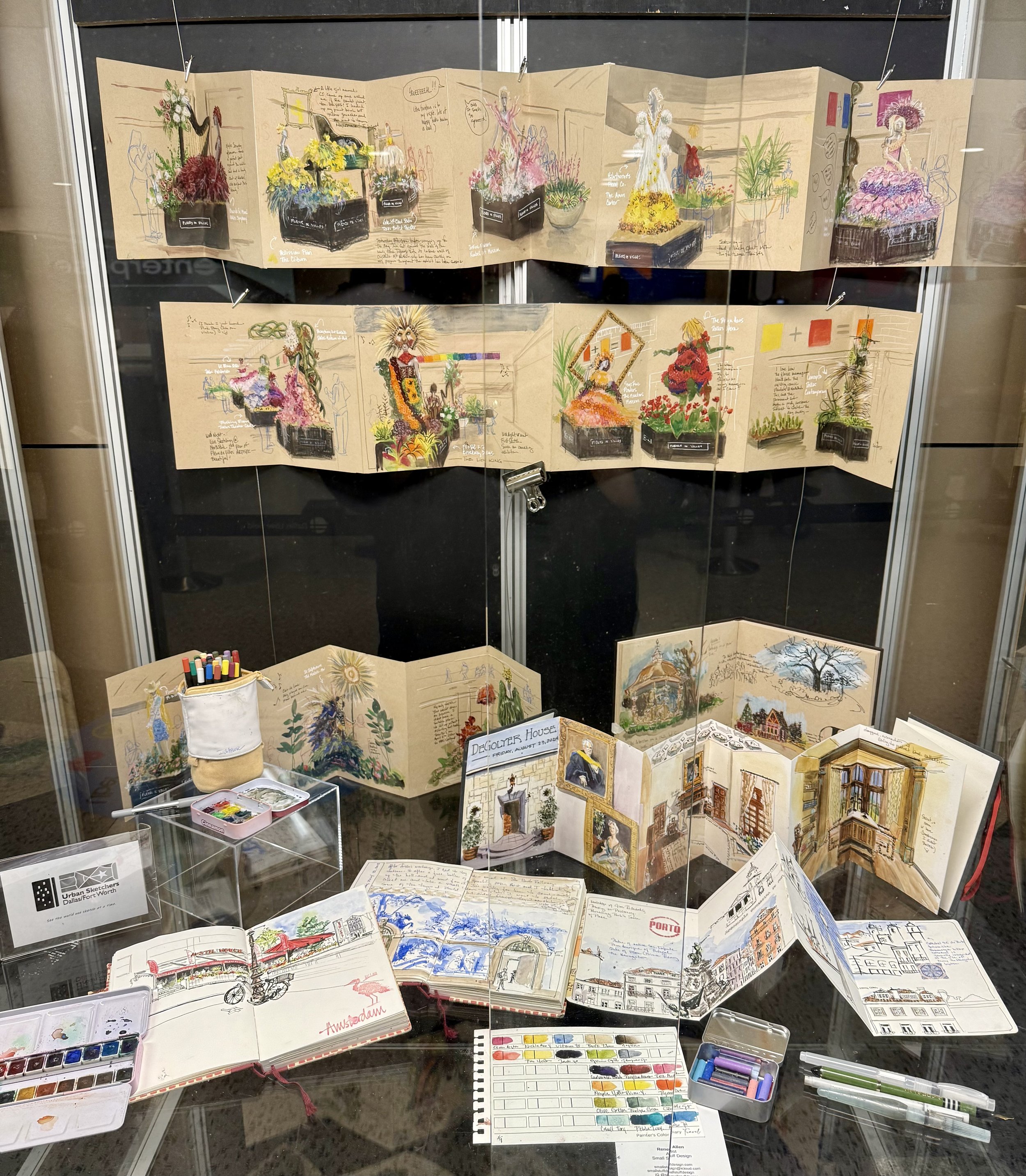
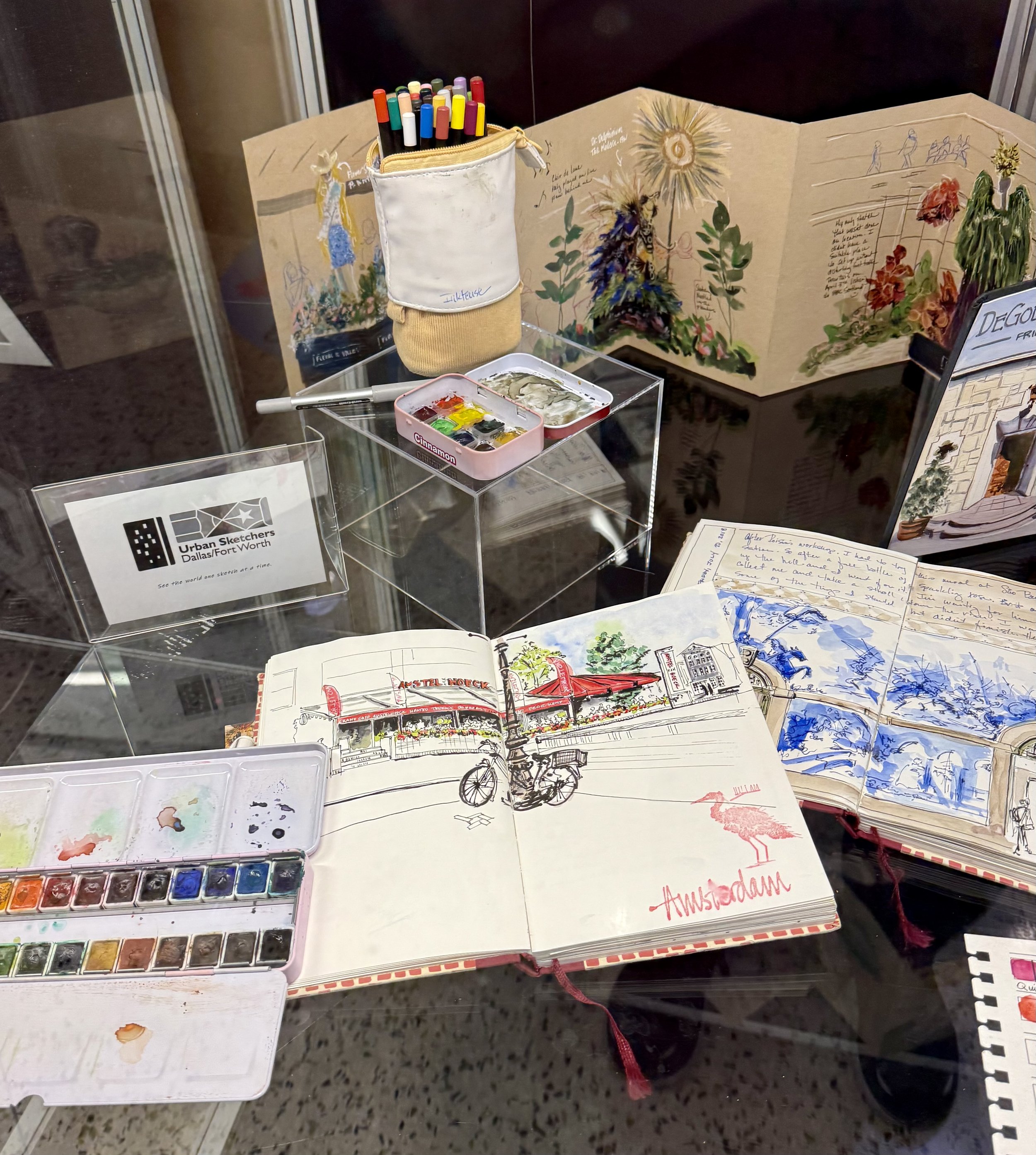
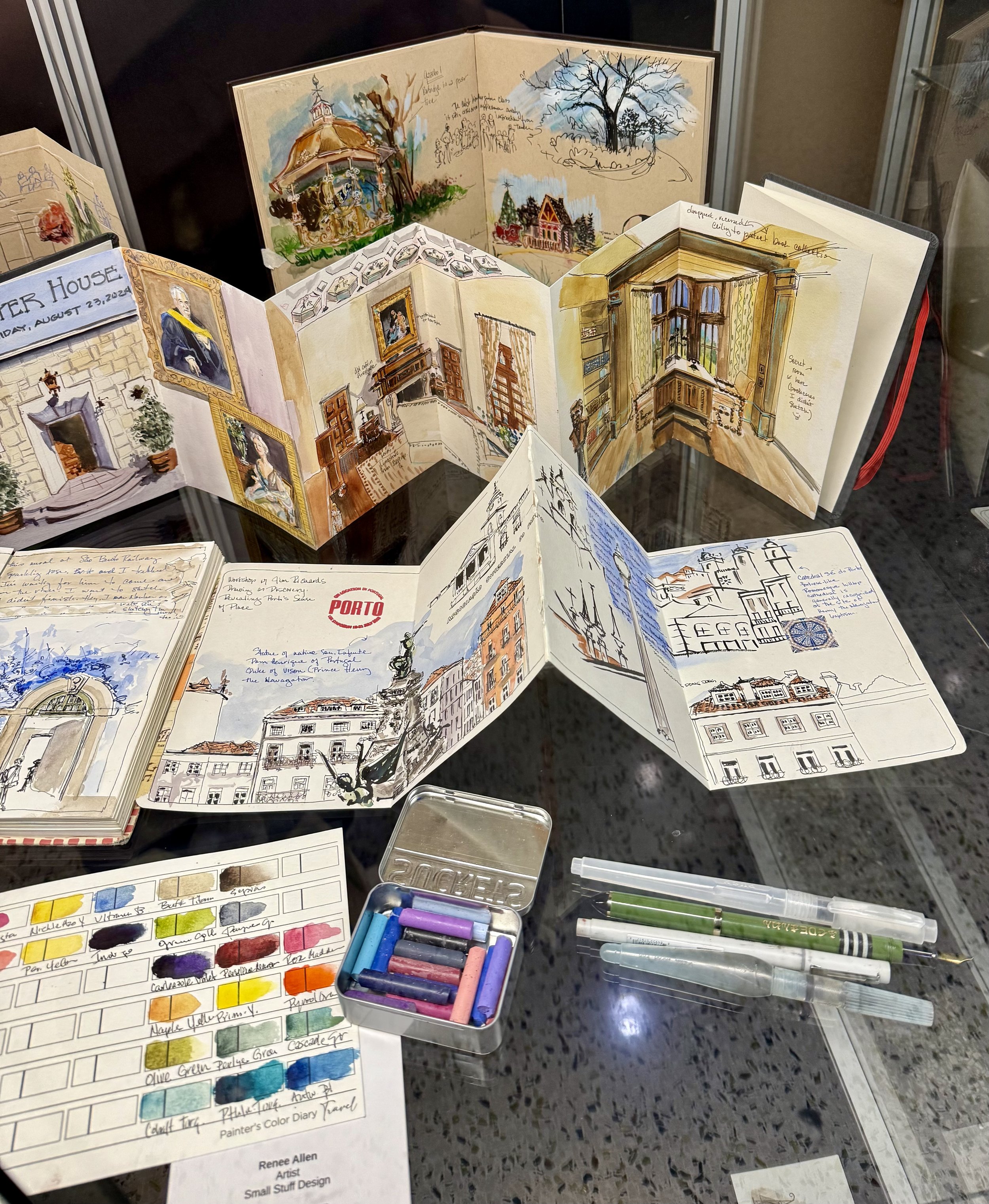
One of the ways I like to create is urban sketching. I bring a sketchbook and sketch kit everywhere I go and break it out whenever possible. I’ve sketched the inside of tire installation businesses, countless restaurants and cafes, airplane cabins, buses, trains.. you get it. I usually get someone approaching asking me about my art and honestly it’s the best thing about making art in public. I know some people don’t like interacting with folks while they are drawing or painting because it messes up their flow and I get that. For me, it’s the opposite. I love making those connections with strangers. They open up about their own art or a daughter or son who likes to draw. They’ll say things like “I wish I had the talent to do that.” or “I can’t draw a stick figure.” and I tell them about something I heard by Roisin Cure, an urban sketcher from Galway, Ireland -I’m paraphrasing here - if you can write, you’ve already learned a visual language. Think about that. You’ve learned how to draw the alphabet in your own style. Drawing is the same. Your drawing in your own hand is your unique visual language. If you’ve been thinking about sketching. Do it!
May- July recap includes:
Waxahachie Urban Sketchers meetup with USKDFW and USKEastTexas
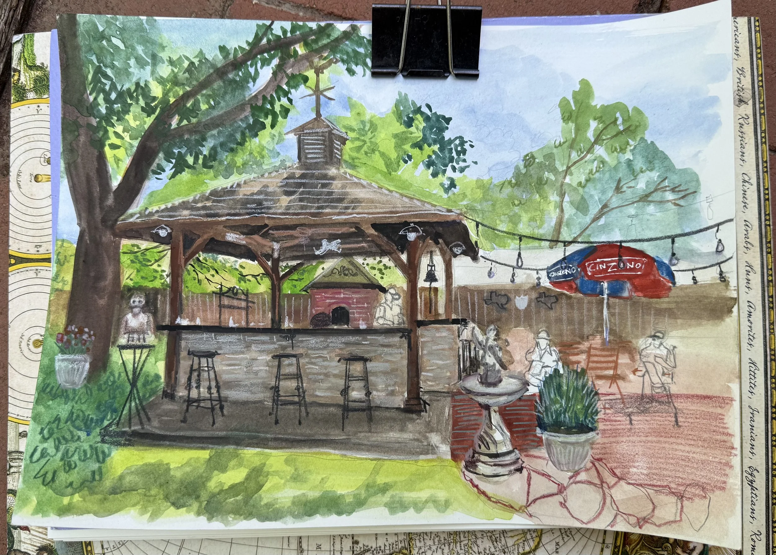
San Angelo Mother’s Day trip and sketching my brother’s backyard kitchen and a cute coffee shop.
San Antonio trip to see Annabelle the doll at Victoria Black Swan Inn (spoiler alert - I didn’t see Annabelle, I stay well away and sketched the hotel.
June USKDFW to Bishop Arts district in Dallas. Didn’t want to feel the heat outside, so ducked into Wild Detectives bookstore for a coffee and the AC.
July USKDFW - another inside venue looking out at the sculptures at Crow Museum of Asian Art at University of Texas- Dallas